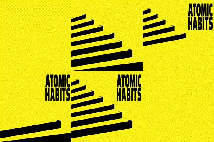
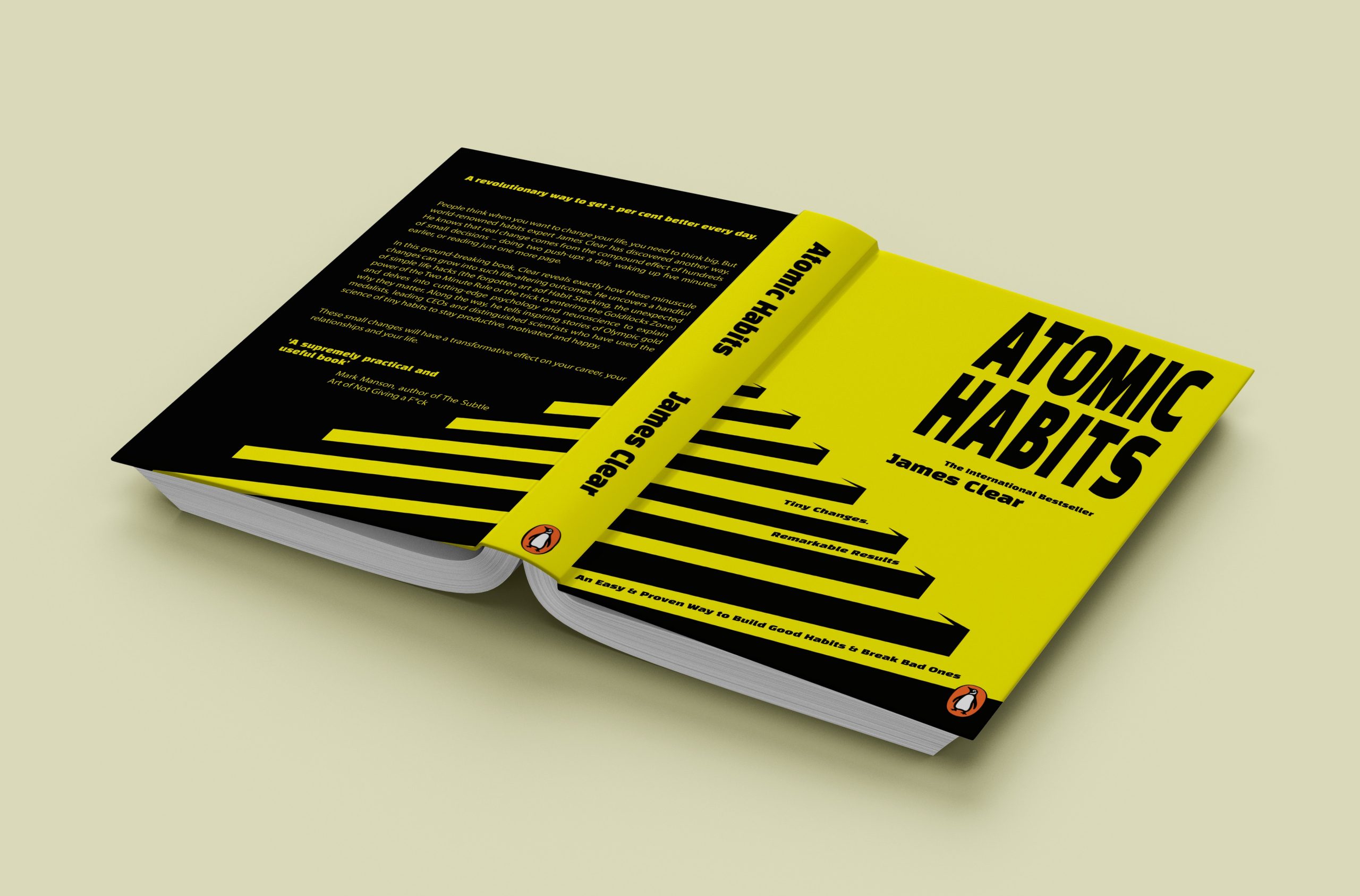
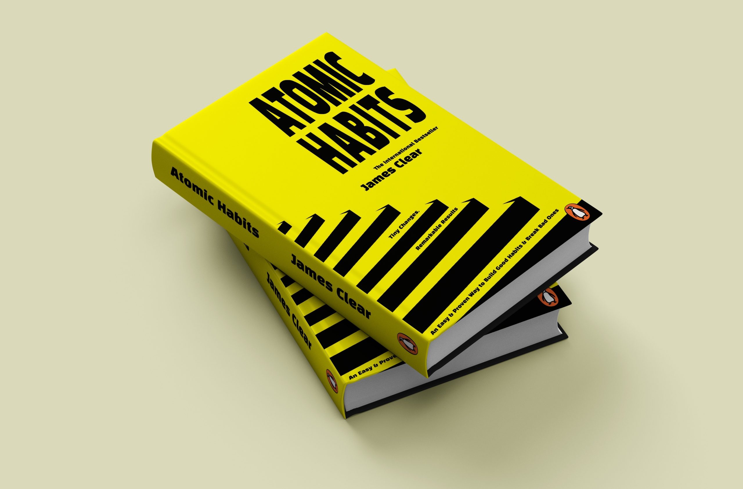
In this cover, Yellow and black have been chosen due to their relation to radioactive symbols and Atoms. Bold typography has been chosen to make it more impactful and fill up the space. High contrast has enabled the steps to move up and fit the text in between. The steps suggest moving upwards to better habits and lifestyle. This follows as a reversed colour to the back cover.


